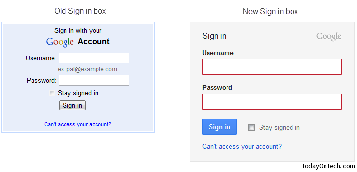
The Gmail interface changed many a times, one of them being the Gmail themes which keep coming in to make the interface look better. Now, the Gmail login screen too is showing a bit change, but that is still a preview and for a few users its already appearing as default.
You can check out the new Gmail sign-in page here, with the changes in the sizes of the credential entry boxes and entire width of the box. The example is gone, as you can use any email address from now, as the Gmail apps pages have been integrated with the normal gmail interface.
These changes have been making the interface of Gmail better but the apps integration have made it impossible to use the same browser in using 2 gmail accounts at a time, unless you have any add-on like the Gmail Manager for Firefox installed.


Gmail new Sign-in Page Looks Neat – Screenshot