Google+ is the latest new social network, aimed at beating the others in the field, i.e. Facebook etc. but has a simpler and better interface, which one would love to have in their mail inbox too. Google has brought in the Google+ interface for the users as a Gmail theme. It sets the inbox in a different and a neater way, with the mails having quite a good gap between each other, the top bar becoming a floating one, so when you scroll down the inbox page the top bar comes along.
How to Set the Google+ Gmail Theme
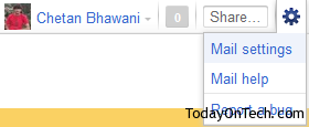
In your gmail inbox, on the top right side you need to click on the Wrench icon, and hit “Gmail settings”
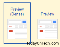
In the Mail settings page, you would see a tab named “Themes”, click on that and you would see a list of Gmail themes available. In the end of the list, there are 2 new themes – The Preview (Dense) Gmail theme and the Preview Gmail theme. Select the Dense one, and you are done.
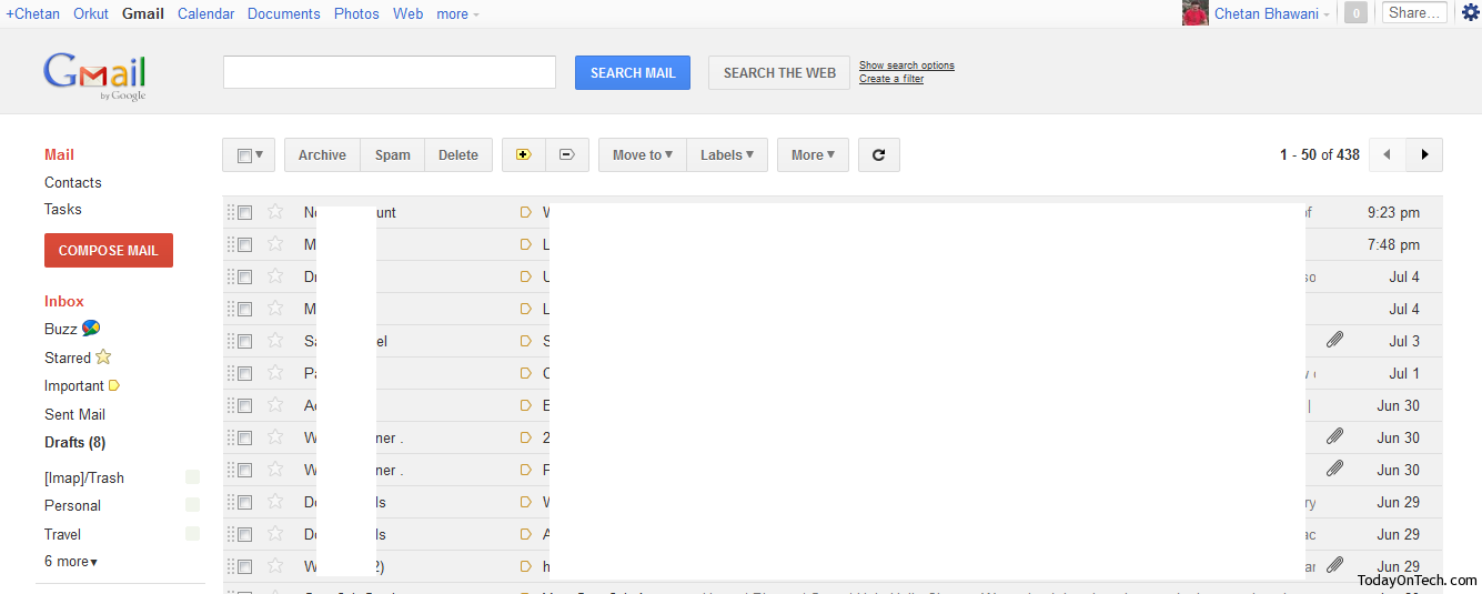
Once you have selected the theme, go to the homepage and you would see the changes with the new gmail theme installed in there. Here is a screenshot that would show how well spread the content in the inbox and the tabs are.
The individual mail looks far better with the recent entry of the people tab on the right, and the Google+ theme looks far better with this.
So setting up the Google+ Gmail theme is pretty easy but you just need to know which theme is the one you need to select to set it.




How to Use / Select The Google+ Gmail Theme?