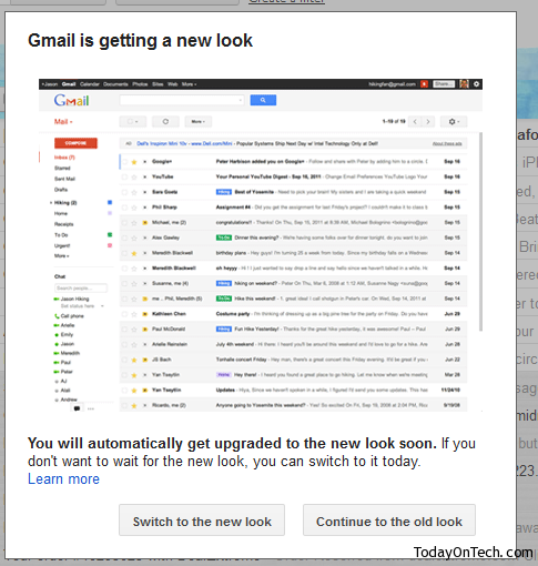
Gmail keeps making changes to its various pages, structure and this time the entire interface is changed with quite a few new additions and betterment in looks of the inbox. The new Gmail would look more cleaner and better than before, and is customizable into different sizes of the mail threads with the instant dropdown options. A couple months back, gmail even rolled out a new sign-in page.
The new Gmail can be switched to, by clicking on the message that comes to users on the right bottom side and for time being, users could go back to the old interface temporarily if they don’t like the new look.
Here are the various changes you would see in the new Gmail look –
- A cleaner and modern view, with the conversations being more streamlined and better and the inbox doesn’t look clogged because of the various looks.
- New themes enter the section to give users more options on changing and making the interface background look better.
- The conversations between multiple people in a single mail thread would make things easier to understand because of the profile picture being shown on every conversation and the entire thread looking like a chat with snippet of each conversation being displayed.
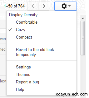
- Customizable – You can see various sizes of the conversations, in the name of Comfortable, Cozy and Compact where the compact one could give the feeling of being a little similar to the previous interface of Gmail.
- New toolbar and a section of gadgets has entered the inbox page, where the chat and gadgets section can be switched to be shown on the front.
- Customizable sidebar height – The sidebar section has the dragging option, where the labels can be hidden and the chat box can be brought higher and look prominent than before.
If you are not satisfied with the new Gmail, you can opt out temporarily by going to the options in the right side just above the mails list. Tip: A few best gmail labs features to enable.


Gmail Rolls out a New Design – Inbox Interface Changed