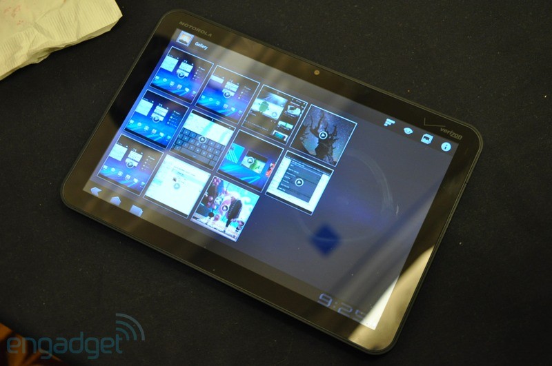
The Android 2.3 Gingerbread was recently launched, and that was for any Android based device, including the mobile phones and the tablet devices. But the Google Android team worked lately on an interface and a separate version of Android that works only for the tablet devices – The Google Android 3.0 Honeycomb.
It’s an interface that is totally changed and looks perfect for large screened android devices i.e. the Android tablets. One of the first devices that showed it functioning is the G-Slate, the official tablet device through Google.
Here is a small tour of the interface of the Android 3.0 Honeycomb –
The homescreen
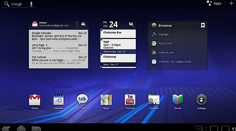
After the normal screen unlock with a slide to the right, you are welcomed by a beautiful and a well spaced homescreen that provides almost everything you would need to look for, as soon as you start the tablet device. The mails, calendar, battery life check, time, dock with the most important apps, options to search etc. all are present on the main screen.
- The left top corner has the options to use the Google text and voice search.
- The right top corner has the section to open the list of Applications that the tablet has.
- The left bottom corner has the back, home and the button to switch between the multiple apps.
- The right bottom corner has the time, Wi-Fi signal and battery life meter.
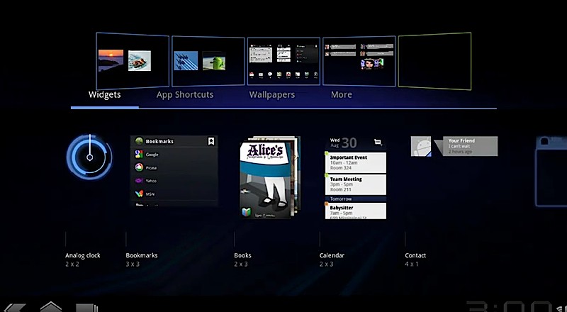
The center section of the home screen has the widgets of Gmail, calendar and the web browser. The screen can be scrolled to the right or left, where new screens with various favorite columns, app shortcuts etc. can be created. The e-mail client, messaging section and the web browser have got quite few noticeable changes, that are made to adjust with the larger screens. Everything runs like a carousel, and things can be customized to give a more aesthetic look to the interface of the Honeycomb.
The Applications
Various applications have got changes and here are a few that are noticed –
Google Maps – Just as what we see in the Google Maps 5.0 version, the top bar is expanded and there is a 3D view of the roads and buildings.
Youtube – The search in youtube has now got the results displayed in grids, and the playback controls have also been changed a lot to make the navigation and video playing quite easier.
Gmail – The app finally gets the needed makeover, where the mail previews and sections are seen in the left column, and the large right column is for the mail content. The same was seen in the Samsung Galaxy tab and iPad has this two-tabbed gmail since long.
Gtalk – This again is a two-tabbed section, with contacts on the left and chat on the right. There are options to switch on the video chat, and you can use either the front, or the rear camera for that.
The Browser
Google made a few good changes with the Web browser in the Android Honeycomb, where you would find things similar to the Google chrome. Tabbed browsing (not sure of the limitation on number of apps, the mobile Android has 8 apps max), incognito mode and the web page bookmarking option, all similar to the chrome browser.
The Virtual Keyboard
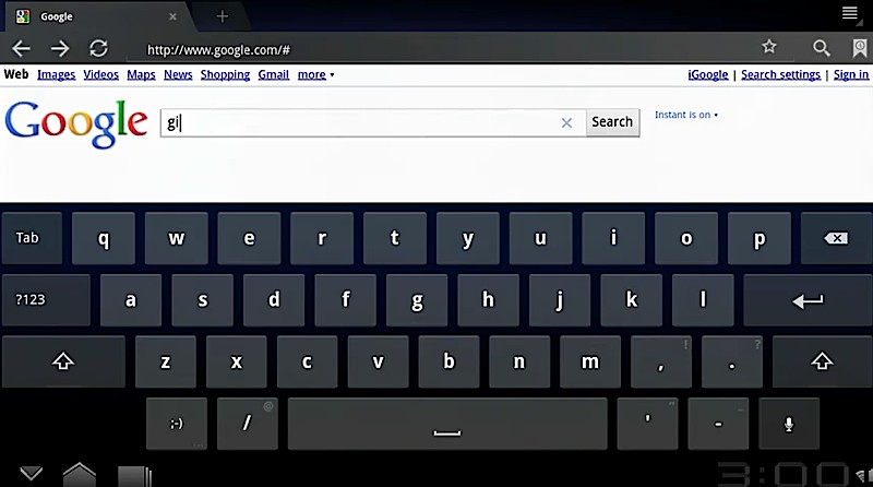
There is a total revamping done with the virtual keyboard, when you compare the same between the Gingerbread and Honeycomb platforms. Many changes are seen, which include –
- The symbols key shifted up, above the shift key from the bottom row previously
- Emoticons key has entered in the place of the symbols key
- The space bar took a position little right than the earlier version
- The delete key shifted on the top right position, above the enter or return key
Spacing and more concentration on the tiny symbols like comma, apostrophe, hyphen etc. makes the keyboard totally different, and one would need some time to adjust to it if they were quite adjusted with the previous virtual keyboard.
More interestingly, this is all checked from just a prototype, and Google has not officially released any specification and a change-log as always.
Check the official video on the Android Honeycomb preview –
Image Credit: Engadget


Android 3.0 Honeycomb for Tablets – Review